Forms Builder
The Forms Builder consists of two main components:
-
The main builder interface provides a powerful yet intuitive environment for creating structured data input forms. Using a drag-and-drop interface, you can quickly build forms with a wide range of input types and validation rules.
-
The Forms Playground allows you to test your forms and see their data output in real-time. As you fill out the form, you can observe how the data is structured and stored, making it easier to understand the relationship between form fields and their resulting data structure.
Builder Interface
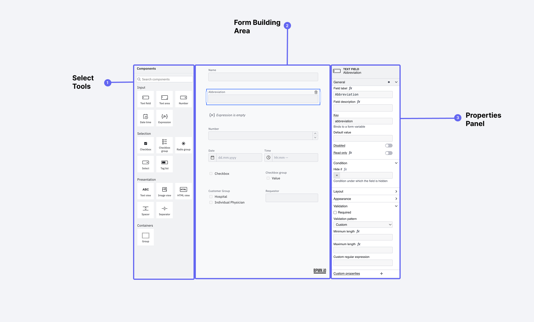 The Forms Builder interface with its key components labeled
The builder interface consists of three main areas:
-
Form Elements Palette
- Drag-and-drop form components
- Wide range of input types
- Layout and structural elements
- Interactive controls
-
Form Canvas
- Visual form layout area
- Drag-and-drop arrangement
- Real-time preview
- Element selection and editing
-
Properties Panel
- Dynamic configuration options
- Validation rules
- Conditional logic
- Styling options
Available Form Elements
The Forms Builder provides a comprehensive set of input elements to handle various data collection needs:
Basic Input Elements
| Element Type | Purpose | Key Features |
|---|---|---|
| Text Field | Single-line text input | Character limits, patterns, placeholders |
| Text Area | Multi-line text input | Auto-resize, character limits |
| Number | Numeric input | Min/max values, step size, units |
| Datetime | Date and time selection | Date ranges, formats, timezone handling |
| Checkbox | Boolean values | Custom labels, default state |
| Radio Group | Single selection from options | Vertical/horizontal layout |
| Select | Dropdown selection | Search, multi-select option |
| Checkbox Group | Multiple selection | Layout options, min/max selections |
Advanced Elements
| Element Type | Purpose | Key Features |
|---|---|---|
| Taglist | Multiple value entry | Custom tags, autocomplete |
| Group | Organize related fields | Collapsible sections |
| Expression Field | Computed values | Formula support |
| Image View | Display images | Size control, alt text |
Layout Elements
| Element Type | Purpose | Key Features |
|---|---|---|
| Spacer | Add vertical space | Custom height |
| Separator | Visual divider | Style options |
Configuring Form Elements
The properties panel adapts to show relevant options based on the selected element:
Common Properties
-
Basic Settings
- Field label
- Help text
- Placeholder text
- key (This is the key that will be used in the data structure to access the data of the field)
- Required field toggle
-
Validation Rules
- Input patterns
- Min/max values
- Character limits
- Custom error messages
-
Appearance
- Width settings
- Alignment options
- Custom styling
- Visibility conditions
Advanced Configuration
-
Conditional Logic
- Show/hide based on other fields
- Enable/disable rules
- Value dependencies
- Custom expressions
-
Data Handling
- Default values
- Data transformation
- Format settings
- Value constraints
Forms Playground
The Forms Playground is a powerful testing environment that helps you understand and validate your form's behavior and data structure. It provides real-time feedback on how your form will function and what data it will generate.
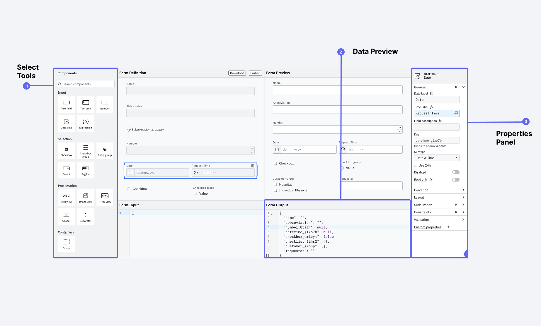 The Forms Playground showing a form preview alongside its JSON data output
Key Features
-
Live Preview
- See your form exactly as users will
- Test interactions in real-time
- Validate conditional logic
- Check responsive behavior
-
Data Output View
- Real-time JSON data structure
- See how form values are stored
- Understand nested data relationships
- Preview computed values
Working with Field Keys
Field keys are crucial for form functionality as they:
- Serve as unique identifiers for each field
- Are used in conditional logic
- Define the structure of output data
- Enable field relationships
When setting field keys:
- Use descriptive names (e.g.,
is_complaintinstead ofcheckbox1) - Follow a consistent naming convention
- Avoid special characters
- Consider the data structure you want to create
Testing Conditional Logic
The Playground is especially useful for testing conditional form behavior:
{
  "is_complaint": true,
  "complaint_type": "product",
  "severity_level": 3,
  "description": "Product malfunction"
}
Example conditions you can test:
- Show severity field if
is_complaint == true - Require description if
severity_level > 2 - Display different options based on
complaint_type
Use the Playground to verify complex conditions:
- Set up your conditional logic
- Fill out the form with different test cases
- Verify both the visibility rules and data output
- Check edge cases and combinations
Import and Export
The Forms Builder provides import and export functionality to help you backup, share, or reuse your forms:
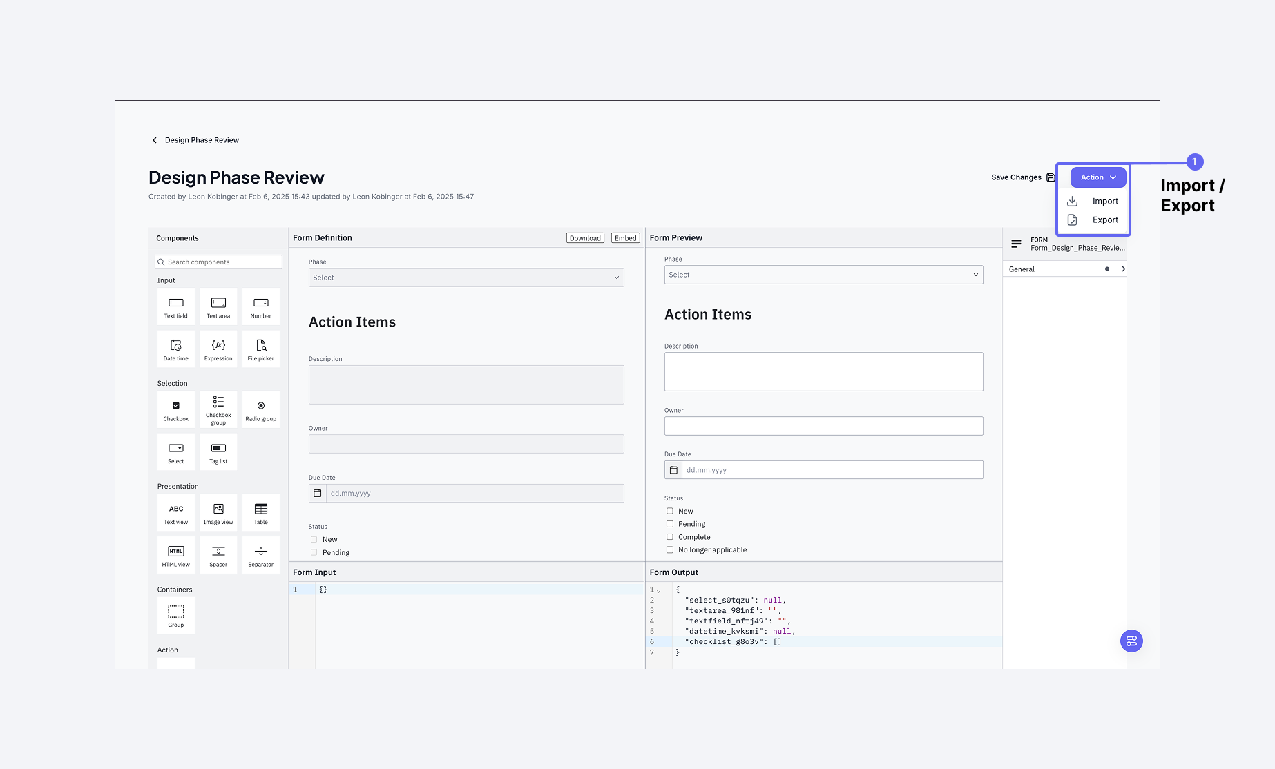 The Forms Builder interface with the import and export options highlighted
Exporting Forms
When you export a form, you'll receive a .form file containing the complete form definition, including all configurations and validations. You can access export options through the Actions menu in the top right corner.
Importing Forms
To import a form:
- Use the Import option from the Actions menu
- Select a
.formfile - The form will be recreated in the Forms Playground with all its configurations
The .form file contains all the information needed to recreate the form, making it perfect for:
- Backing up form definitions
- Sharing forms between systems
- Creating form templates